DESCRIBBING TRENDS IN SCATTER PLOTS
Subscribe to our ▶️ YouTube channel 🔴 for the latest videos, updates, and tips.
A scatter plot is a graph in which ordered pairs of data are plotted. We can use a scatter plot to determine if a relationship, or an association exists between two sets of data. This is also known as a correlation.
What is trend line ?
Trend lines are lines used to approximate the general shape of a scatter plot.
There are kinds of association.
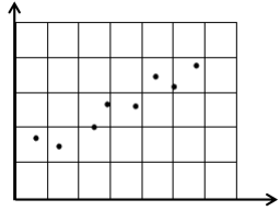
What is positive association ?
As the x values increases the y-values tend to increase.
Note :
If the points in the scatter plot are very close to each other and trend line is raising line then we would say there is strong positive correlation.
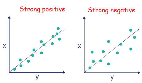
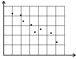
What is negative association ?
As x-values increases the y-values tend to decrease.
Note :
If the points in the scatter plot are very close to each other and trend line is falling line then we would say there is strong negative correlation.
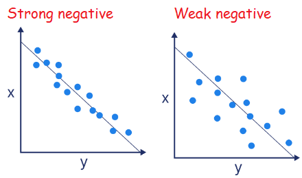
What is no correlation ?
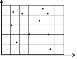
In no correlation, the points are plotted like randomly scattered.
Problem 1 :
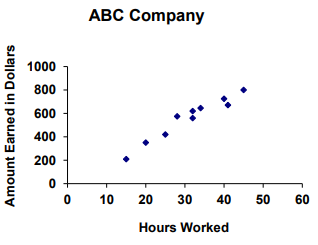
The scatter plot below shows a relationship between hours worked and money earned. Which best describes the relationship between the variables?
A) Strong positive correlation B) Weak positive correlation
C) Strong negative correlation D) Weak negative correlation
Solution :
The dots are closer and the line of best fit should be a raising line. So, the answer is strong positive correlation.
Problem 2 :
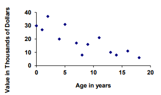
This scatter plot shows the relationship between the age of a car and its value. Which best describes the relationship between the variables?
A) Strong positive correlation B) Weak negative correlation
C) Strong negative correlation D) No correlation
Solution :
The line of best fit is a falling line. So, weak negative correlation.
Problem 3 :
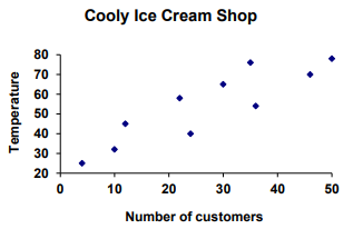
This scatter plot shows a relationship between the outdoor temperature and number of customers in an ice cream store. Which best describes the relationship between the variables?
A) Strong positive correlation B) Weak positive correlation
C) Weak negative correlation D) No correlation
Solution :
The answer is weak positive correlation.
Problem 4 :
This scatter plot shows a relationship between the TVs purchased and prices. Which best describes the relationship between the variables?
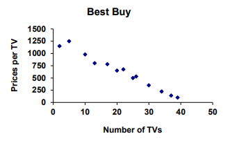
A) Strong positive correlation B) Weak positive correlation
C) Strong negative correlation D) Weak negative correlation
Solution :
Line of best fit must be a falling line and by observing the spread, there is strong negative correlation.
Problem 5 :
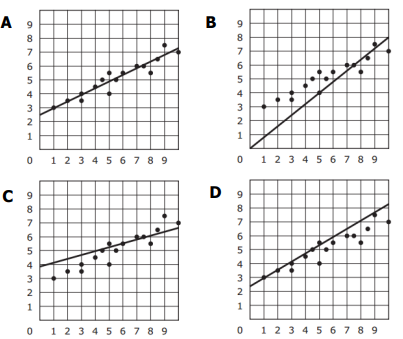
Which graph has a Trend Line that is the best fit for the data? C
Solution :
The line of best fit should have about the same number of data points above as it has below and should be between the data points. Only choice A shows that.
Option A is correct.
Problem 6 :
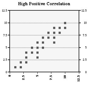
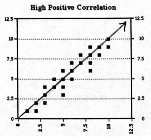
Draw a line of best fit:
Solution :
Problem 7 :
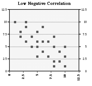
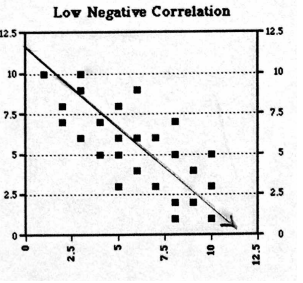
Solution :
Problem 8 :
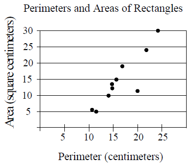
The scatter plot above shows the perimeters and areas of 10 rectangles. What is the perimeter, in centimeters, of the rectangle represented by the data point that is farthest from the line of best fit (not shown)?
Solution :
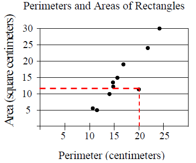
The coordinate of the farthest point is (20, 12)
20 = Perimeter of the rectangle
12 = Area of the rectangle
So, the required answer is 12.
Subscribe to our ▶️ YouTube channel 🔴 for the latest videos, updates, and tips.
Recent Articles
-
Finding Range of Values Inequality Problems
May 21, 24 08:51 PM
Finding Range of Values Inequality Problems -
Solving Two Step Inequality Word Problems
May 21, 24 08:51 AM
Solving Two Step Inequality Word Problems -
Exponential Function Context and Data Modeling
May 20, 24 10:45 PM
Exponential Function Context and Data Modeling