DESCRING THE ASSOCIATION OF A SCATTER PLOT WORKSHEET
Subscribe to our ▶️ YouTube channel 🔴 for the latest videos, updates, and tips.
Problem 1 :
The scatter plot above shows the average scores of 10 golfers and their weekly practice times. The line of best fit is also shown.
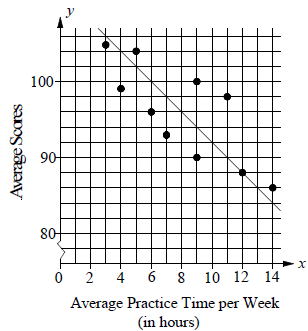
What is the average score of golfer that is farthest from the line of best fit ?
a) 93 b) 96 c) 98 d) 99
Problem 2 :
Using the scatter plot above, answer the following.
There are two golfers whose average practice time is the same. What is the difference between their average scores ?
a) 4 b) 6 c) 8 d) 10
Problem 3 :
According to the line of best fit in the scatter plot above. Which of the following best approximate the year in which the number of cars repaired by Jay's Motor was estimated be 4500 ?
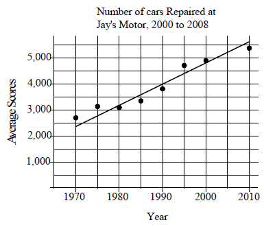
a) 1996 b) 1998 c) 2000 d) 2002
Problem 4 :
The scatter plot below shows the average traffic volume and average vehicle speed on a certain freeway for 50 days in 1999.
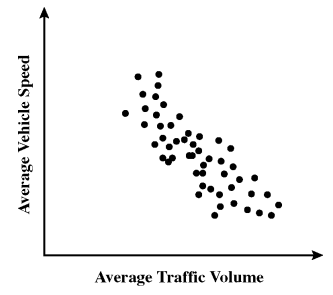
Which statement best describes the relationship between average traffic volume and average vehicle speed shown on the scatter plot ?
a) As traffic volume increases, vehicle speed increases.
b) As traffic volume increases, vehicle speed decreases.
c) As traffic volume increases, vehicle speed increases at first, then decrease.
d) As traffic volume increases, vehicle speed decreases at first, then increases.
Problem 5 :
Ms. Ochoa recorded the age and shoe size of each student in her physical education class. The graph below shows her data.
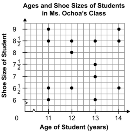
Which of the following statements about the graph is true ?
a) The graph shows positive association.
b) The graph shows negative association.
c) The graph shows a constant association.
d) The graph shows no association.
Problem 6 :
Which graph best shows a positive correlation between the number of hours studied and the test scores ?
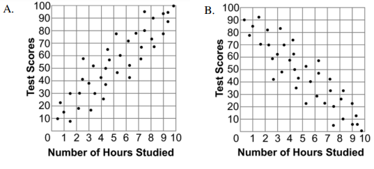
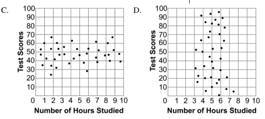
Problem 7 :
Use the scatter plot below to answer the following question.
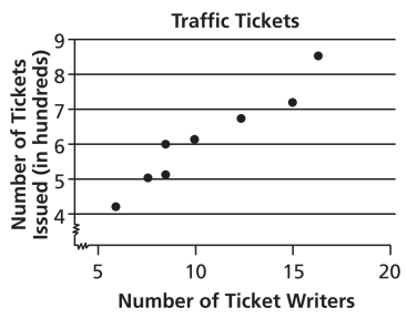
The police department tracked the number of ticket writers and the number of tickets issued for the past 8 weeks. The scatter plot shows the results. Based on the scatter plot, which statement is true ?
a) More ticket writers results in fewer tickets issued.
b) There were 50 tickets issued every week.
c) When there are 10 ticket writers, there will be 800 tickets issued.
d) More ticket writers result in more tickets issued.
Answer Key
1) So, the required average score is 98.
2) 10
3) Accordingly option given 1996 will be the best prediction.
4) So, option b is correct.
5) the graph shows no association.
6) option a is correct.
7) So, option d is correct.
Subscribe to our ▶️ YouTube channel 🔴 for the latest videos, updates, and tips.
Recent Articles
-
Finding Range of Values Inequality Problems
May 21, 24 08:51 PM
Finding Range of Values Inequality Problems -
Solving Two Step Inequality Word Problems
May 21, 24 08:51 AM
Solving Two Step Inequality Word Problems -
Exponential Function Context and Data Modeling
May 20, 24 10:45 PM
Exponential Function Context and Data Modeling