COMPARING DATA DISPLAYED IN DOT PLOTS WORKSHEET
Subscribe to our ▶️ YouTube channel 🔴 for the latest videos, updates, and tips.
Problem 1 :
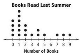
It is a graph in which each value is shown as a __________ (or and x) above a number line. Each dot (or x) represents __________ response.
1) How many people read 4 books last summer?
2) How many people read 1 book last summer?
3) How many people were surveyed?
4) Only 2 people read _____ books last summer
Problem 2 :
Use the data in the dot plot to answer questions.

1) What is the mean number of shells collected?
2) What is the median number of shells collected?
3) What is the mode?
4) What is the range?
Problem 3 :
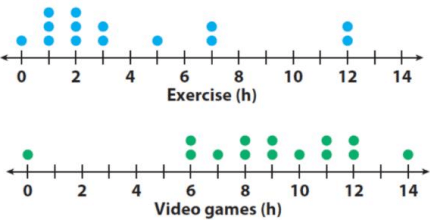
Fourteen students were surveyed about the time they spend exercising and playing video games each week.
Compare the data by answering the questions.
1) What is the range for the hours of exercise?
For playing video games?
2) What is the mode for exercise? Playing video games?
3) What is the median hours spent exercising? Playing video games?
4) What is the mean number of hours spent exercising? Playing video games?
Problem 4 :
Mrs. Andrews surveyed the students in her math classes to fnd out how many minutes each one studied for the last test. She created a dot plot for 1st period and for 2nd period.
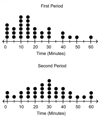
Which of the following statements are supported by the data in the two dot plots?
I. The least number of minutes students studied in Mrs. Andrews’ 1st period is greater than the least number of minutes students studied in Mrs. Andrews’ 2nd period.
II. The data for Mrs. Andrews’ 2nd period is more symmetrical than the data for Mrs. Andrews’ 1st period.
III. The mode number of minutes students studied in Mrs. Andrews’ 1st period is less than the mode number of minutes students studied in Mrs. Andrews’ 2nd period.
IV. The range of the data for Mrs. Andrews’ 1st period is less than the range of the data for Mrs. Andrews’ 2nd period.
V. The median number of the data for Mrs. Andrews’ 2nd period is greater than the median number of the data for Mrs. Andrews’ 1st period.
VI. The data for Mrs. Andrews’ 1st period is skewed more to the right than the data for Mrs. Andrews’ 2nd period
Problem 5 :
The double dot plot shows the numbers of junk emails that were received by Marcus and Anders for the past twenty days. Which inference about the two populations is true?
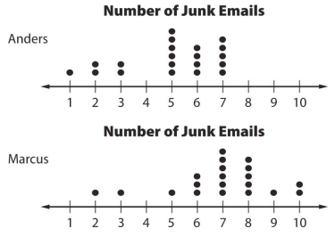
A) Both sets of data have the same interquartile range.
B) Both sets of data have the same median.
C) Anders’s data centers around 6 and Marcus’s data centers around 7.
D) The interquartile range for Anders’s data is 0.5 greater than the interquartile range for Marcus’s data.
Problem 6 :
The dot plots show the number of miles run per week for two different classes.
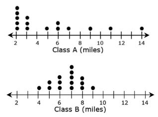
Based on the data in the dot plots, write the following:
- A true statement comparing the ranges of the data in the dot plots.
- A true statement comparing the medians of the data in the dot plots.
- A false statement comparing the modes of the data in the dot plots.
Subscribe to our ▶️ YouTube channel 🔴 for the latest videos, updates, and tips.
Recent Articles
-
Finding Range of Values Inequality Problems
May 21, 24 08:51 PM
Finding Range of Values Inequality Problems -
Solving Two Step Inequality Word Problems
May 21, 24 08:51 AM
Solving Two Step Inequality Word Problems -
Exponential Function Context and Data Modeling
May 20, 24 10:45 PM
Exponential Function Context and Data Modeling